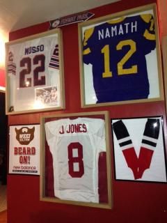
Question: Alabama Crimson paint

Scottbama555

New Member
Mar 29, 2016
10
0
0
Can anybody recommend an accurate Alabama Crimson paint manufacturer and color name? I'm getting ready to do up a Bama room.


Sent from my iPhone using Tapatalk
 

B1GTide

TideFans Legend
Apr 13, 2012
47,874
55,183
187
Most places will color match if you bring them something already the color that you are looking for.
 

TiderJack

Hall of Fame
Jul 9, 2010
13,177
8,977
187
Inverness, AL
Per Rolltide.com Alabama crimson is Pantone# 201. The Wiki page for crimson also says Bama crimson is pantone# 201. You just need to ask for this pantone#.
 

Sensation77

Scout Team
Sep 18, 2006
121
157
67
Gallatin, Tennessee, United States
If you go to your local PPG or Porter Paint store, you can have them call the Tuscaloosa store and get the formula for the official color. It is the official color approved by Mal Moore when he was AD. I was looking for it back in the Fall when I was building my house, and I called the Tuscaloosa store myself. They said just have my local store call them, and they would give them the formula. Hope this helps.
 

uafan4life

Hall of Fame
Mar 30, 2001
16,296
8,449
287
44
Florence, AL
This is always tricky. The official crimson color - which is supposed to be used on all printed logos - is Pantone 201C. However, you can't take that to your average, local paint store and have them mix up a batch of that. You can't even give them RGB or CMYK values for them to use. They need a paint "dye" formula. Which means using a PPG store (assuming one's available), having them call the Tuscaloosa store to get the formula, hoping it gets properly translated over the phone, and hoping the tech mixes it properly.

Also, the color matching at those places is not very good. I took a properly printed PMS 201C sample - printed on a high-quality, calibrated printer - to three different stores to get samples of different paints to try. All three were noticeably different from each other as well as noticeably different from the printed sample after drying on the wall.

On top of that, paint is not paint is not paint. The color that a particular paint "formula" appears on a wall in a room is dependent upon the brand/type of paint purchased, the sheen of the paint, the base (paint, primer, bare sheetrock) upon which the paint is applied, the number of coats of paint applied, and - more than you'd think - the amount of direct sunlight as well as the light bulbs in the room.

Also, if you compare your Alabama memorabilia, you'll find at least half a dozen or more different shades of "crimson" - none of which might actually match a properly printed PMS 201C sample.

I recently painted my office and ran into the same conundrum. I was also very perplexed and annoyed at not being able to give them a common color identifier - from the very system that is used to ensure that their printed paint strip samples match their paint on the wall - and have them mix the paint. So, I made one design decision, did a lot of research, and came up with what I think was an excellent solution.

First, rather than painting the whole room crimson I painted one "accent" wall crimson and the rest gray. From a decorating perspective, I have my non-crimson - mostly black and white - memorabilia on the crimson wall so that there's not any clashing crimson. My other stuff - at least what of my collection I chose to put in my office - is on the gray walls.

Second, I found two standard Benjamin Moore paints that are within a 95%-97% match for the official crimson and gray for which virtually every paint store will have the formula:
Crimson: Benjamin Moore Flamenco - CSP-1195
Gray: Benjamin Moore Cinder - **-705

I went with Valspar Signature from Lowes (they had a really good deal at the time) in a a semi-gloss finish. The semi-gloss finish looks great on textured walls. For flat walls I would go with satin.

Note, the Cinder is not as close to a perfect match to the gray as the Flamenco is to the crimson; it's a little bit lighter. However, especially for small to medium sized rooms, a little lighter is better. Also, the Flamenco is going to look way too bright red going on but it dries darker.

Good rule of thumb for painting samples on a wall: wait 24 hours before really looking at them. :)
 
Last edited:

seebell

Hall of Fame
Mar 12, 2012
11,914
5,112
187
Gurley, Al
Nail on the head UAF4L. We had a thread about this a long while ago-I couldn't find it- and the general consensus was that there seems to be several different crimson colors. Helmets vs jersey color etc etc. "official" fan clothing seems to vary from supplier to supplier. Find an official crimson you like and go with it. If your guest says "that don't look like official crimson" throw his butt out. Substrate, sheen. light reflectance value and adjacent colors all make a difference.

So says seebell, formerly know as the best paint contractor east of the Mississippi River.:)
 

KentuckianaBFan

All-SEC
Jan 26, 2011
1,782
4
57
Lakeland, FL, 2018
echoaffiliate.com
This is always tricky. The official crimson color - which is supposed to be used on all printed logos - is Pantone 201C. However, you can't take that to your average, local paint store and have them mix up a batch of that. You can't even give them RGB or CMYK values for them to use. They need a paint "dye" formula. Which means using a PPG store (assuming one's available), having them call the Tuscaloosa store to get the formula, hoping it gets properly translated over the phone, and hoping the tech mixes it properly.

Also, the color matching at those places is not very good. I took a properly printed PMS 201C sample - printed on a high-quality, calibrated printer - to three different stores to get samples of different paints to try. All three were noticeably different from each other as well as noticeably different from the printed sample after drying on the wall.

On top of that, paint is not paint is not paint. The color that a particular paint "formula" appears on a wall in a room is dependent upon the brand/type of paint purchased, the sheen of the paint, the base (paint, primer, bare sheetrock) upon which the paint is applied, the number of coats of paint applied, and - more than you'd think - the amount of direct sunlight as well as the light bulbs in the room.

Also, if you compare your Alabama memorabilia, you'll find at least half a dozen or more different shades of "crimson" - none of which might actually match a properly printed PMS 201C sample.

I recently painted my office and ran into the same conundrum. I was also very perplexed and annoyed at not being able to give them a common color identifier - from the very system that is used to ensure that their printed paint strip samples match their paint on the wall - and have them mix the paint. So, I made one design decision, did a lot of research, and came up with what I think was an excellent solution.

First, rather than painting the whole room crimson I painted one "accent" wall crimson and the rest gray. From a decorating perspective, I have my non-crimson - mostly black and white - memorabilia on the crimson wall so that there's not any clashing crimson. My other stuff - at least what of my collection I chose to put in my office - is on the gray walls.

Second, I found two standard Benjamin Moore paints that are within a 95%-97% match for the official crimson and gray for which virtually every paint store will have the formula:
Crimson: Benjamin Moore Flamenco - CSP-1195
Gray: Benjamin Moore Cinder - **-705

I went with Valspar Signature from Lowes (they had a really good deal at the time) in a a semi-gloss finish. The semi-gloss finish looks great on textured walls. For flat walls I would go with satin.

Note, the Cinder is not as close to a perfect match to the gray as the Flamenco is to the crimson; it's a little bit lighter. However, especially for small to medium sized rooms, a little lighter is better. Also, the Flamenco is going to look way too bright red going on but it dries darker.

Good rule of thumb for painting samples on a wall: wait 24 hours before really looking at them. :)

The surface that the paint is applied to does make a difference, as well as how opaque the paint is. I worked in the ink industry for 10 years, and we made inks for corrugated boxes, displays, brown and white bags (fast food), and poly bags (remember that yellow smiley face on a blue WM bag?). The C in PMS 201 C designates a "Coated" surface that the color is applied to...PMS 201 U is the same color applied to an uncoated surface...if you go to the PMS website and look at PMS 201, the C and U colors look completely different. I haven't tried it, but wonder if applying the Crimson over a gloss white would brighten the crimson--just a thought...Best of luck with your project.
 

Bama Reb

Suspended
Nov 2, 2005
14,445
0
0
On the lake and in the woods, AL
Nail on the head UAF4L. We had a thread about this a long while ago-I couldn't find it- and the general consensus was that there seems to be several different crimson colors. Helmets vs jersey color etc etc. "official" fan clothing seems to vary from supplier to supplier. Find an official crimson you like and go with it. If your guest says "that don't look like official crimson" throw his butt out. Substrate, sheen. light reflectance value and adjacent colors all make a difference.

So says seebell, formerly know as the best paint contractor east of the Mississippi River.:)
Any color that's even close to Crimson is better than orange!
 

uafan4life

Hall of Fame
Mar 30, 2001
16,296
8,449
287
44
Florence, AL
If you ever want to take working vacation, over to Texas, let me know. Can find lots of work for you.

I'm assuming that you were directing this at me...


Vacations to Texas always end up with visits to the in-laws for some odd reason, so they're always working vacations. :rolleyes:
 

Hoot30

All-SEC
Jan 12, 2005
1,284
6
57
51
Nashville, TN
I painted a room in my current house about 5 years ago. All I did was bring in a car magnet to my local Porter paint store and they scanned it and matched the paint. Here's a tip if it hasn't been mention yet: Painting with red is tricky. It took 5 coats of paint to get the color right. Also, I didn't use white primer. I used a latex red paint as a primer. The clerk at the paint store also suggested to use a gray primer when painting with red.
 

37bamagreats55

All-American
Apr 1, 2003
2,324
46
67
47
Gardendale, AL
Several years ago (6ish), I painted my Bama room using colors from The Home Depot - they used to have a "college colors" deal, so I'm not sure if they still carry the paint or not. Most folks on here have seen my room several times, so I'll share only one photo, but it turned out really, really good. Roll Tide and good luck! Would love to see the finished product.


ROTYDE

All-American
Nov 10, 2003
4,484
46
167
Muscle Shoals got the Swampers
SWEET!!!

Several years ago (6ish), I painted my Bama room using colors from The Home Depot - they used to have a "college colors" deal, so I'm not sure if they still carry the paint or not. Most folks on here have seen my room several times, so I'll share only one photo, but it turned out really, really good. Roll Tide and good luck! Would love to see the finished product.

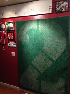
 

uafan4life

Hall of Fame
Mar 30, 2001
16,296
8,449
287
44
Florence, AL
Several years ago (6ish), I painted my Bama room using colors from The Home Depot - they used to have a "college colors" deal, so I'm not sure if they still carry the paint or not. Most folks on here have seen my room several times, so I'll share only one photo, but it turned out really, really good. Roll Tide and good luck! Would love to see the finished product.
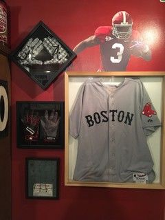
That's the Glidden line at the Home Depot. I got a sample of that and it was way too dark - compared to the official Alabama Crimson. Of course, most of the Nike clothing is much darker than the official Alabama Crimson, so it's actually more likely to match the Jerseys and stuff.

I'm a bit anal and borderline OCD on some things so having the official color - or at least as close as possible - was a big thing for me. The Glidden Alabama paint is actually only an 80% match; it's closer to Mississippi State's Burgundy than Alabama's Crimson.

Of course, your room looks great so it's hard to argue with results. :)
 

wishbonedays

1st Team
Mar 30, 2003
663
4
0
Hanceville, AL, USA
www.wfl1974.com
I went to Lowe's (in Cullman) and the guy at the paint counter showed me their display that had the "Alabama Crimson" on it. I thought that it looked a little bit dark, I even took an article for them to color-match. But after I bought it and painted the study, I was quite happy with it. I had previously used a color that was called "Chinese Red", but it was too...well, red, not quite dark and rich enough. I don't know if its that exact same pantone#, but he said it was the official color from the University, so I trusted him, although I'm not certain I could tell the difference after I looked at it in a store under the florescent lights and then got home with it. But in the end I was happy with the results.


Latest threads